Maintaining a consistent visual language across a complex product ecosystem is one of the hardest challenges in UI design. You start with an open-source pack, and everything looks clean. Then you hit a wall. The pack is missing a niche necessity, like “database-restore” or “user-authentication-error.”
You have two choices. Draw it yourself, or grab a close-enough match from a different set.
Most choose the latter. The result? Mismatched line weights, conflicting corner radii, and odd styling differences. This creates a “Frankenstein” UI that subtly degrades the user experience.
Icons8 solves this fragmentation problem by changing the supply model. It doesn’t function as a marketplace for disparate designers. It operates as a single, massive production house.
With over 1.4 million icons, the platform focuses on depth within specific styles. Choose the “Material Outlined” style, and you aren’t getting 200 icons. You get over 5,000 icons that adhere to the exact same stroke width and geometric rules. Teams can scale interface designs without hiring dedicated iconographers to fill the gaps.
Scenario: Building a High-Fidelity SaaS Dashboard
Picture a UI designer tasked with creating a financial dashboard for a fintech application. The requirements are strict. The interface must adhere to Apple’s Human Interface Guidelines because the primary touchpoint is an iPad app.
The designer selects the “iOS 17” style family from the library. This single set contains over 30,000 icons.
Volume is critical here. A standard icon pack might have a generic “money” icon. But a fintech project requires specific distinctions between “wire transfer,” “crypto wallet,” and “recurring payment.”
Working directly inside Figma via the plugin, the designer drags in the “Outlined” version of icons for the inactive state of the navigation bar. For active states, they don’t need to manually fill shapes or add strokes. They simply switch to the “Filled” or “Glyph” variant of the same icon family.
The visual weight remains mathematically consistent between the two states.
Data visualization widgets present another hurdle. The designer needs to represent abstract concepts like “market volatility.” They search the library and find the specific chart icons needed. Because the style is standardized, the 2px stroke on the chart icon matches the 2px stroke on the user profile icon in the top right corner. No need to open Illustrator to tweak paths. The library enforces consistency automatically.
Scenario: Rapid Prototyping for Web Developers
Frontend developers often face a different pressure: speed.
Imagine a developer building a React-based prototype for a client who needs to see a working travel booking site by Friday. The visual quality cannot look “broken,” but there is no time for custom assets.
The developer needs a booking flow with animated feedback. Instead of asking a motion designer for help, the developer filters the Icons8 search by “Animated.” They find a “success” checkmark and a “processing” loader.
Using the platform’s export options, the developer downloads the Lottie JSON file. They embed the animation directly into the code. It remains crisp on high-density mobile displays without the file size bloat of a GIF.
For static UI elements, the developer uses the CDN link feature. Instead of downloading files, renaming them, and organizing a local asset folder, they paste the generated HTML link directly into the prototype. Rendering is immediate.
Later, the client asks to change the primary brand color from blue to green. The developer doesn’t need to re-export assets. They use the API or link customization to adjust the hex code. Every icon across the prototype updates instantly.
Workflow: The Marketing Slide Deck
Quinn, a content marketing manager, is preparing a quarterly review deck. The deadline is tight. The design team is booked solid. Quinn needs to visualize data points regarding user growth and server downtime without making the slides look amateurish.
- Selection: Quinn opens Pichon, the Icons8 Mac app living in the menu bar. No need to tab back and forth to a browser.
- Style Match: The presentation uses a modern, slightly playful aesthetic. Quinn selects the “3D Fluency” style to match the vibe, avoiding the flat, technical look of standard system icons.
- Customization: One key slide has a dark navy background. The default icons are too dark. Quinn right-clicks an icon in the app to open the editor.
- Editing: In the editor, Quinn adjusts the base color of the 3D element to a bright yellow. It now pops against the navy.
- Placement: Quinn drags the high-resolution PNG directly from the app onto the Keynote slide.
- Footer Design: For the contact section, they quickly pull up the necessary social media icons from the free Logos category. This ensures brand compliance without worrying about trademark inaccuracies.
The entire process takes minutes. The result looks like a bespoke 3D illustration set commissioned specifically for the deck.
Comparisons with Alternatives
To understand where Icons8 fits, look at the spectrum of icon availability.
Vs. Open Source (Feather, Heroicons)
Open-source packs like Feather or Heroicons are excellent for simple projects. They are completely free. But they are often limited to 200-300 core concepts. If your app requires a specific icon for “radiology” or “freight-shipping,” you will hit a dead end. Icons8 wins on volume and niche specificity.
Vs. Flaticon / Noun Project
These platforms are marketplaces. Search for “dog,” and you get 5,000 dogs drawn by 5,000 different people. The variety is immense, but consistency is low. Building a cohesive interface is difficult because you have to manually hunt for icons sharing the same corner radius and line endings. Icons8 is a single production house. The “dog” icon matches the “cat” icon perfectly because they were designed under the same guidelines.
Vs. In-House Design
Designing in-house offers ultimate control. It is also the most expensive option. Unless you are Google or Apple, maintaining a proprietary library of 2,000+ icons is rarely a good ROI. Icons8 serves as a “rented” in-house team.
Limitations and When to Look Elsewhere
The library is extensive, but it is not the right solution for every project.
- Distinctive Branding: If your brand identity relies on a unique, never-before-seen illustration style, these icons might feel too “standard.” They are designed to be universally understood. Sometimes that means sacrificing artistic flair for clarity.
- Vector Access Costs: The free tier is generous with categories but limited to PNGs up to 100px. If you need SVGs for responsive web design or print-ready PDFs, you must have a paid subscription. Developers relying strictly on free resources for production code will find the PNG limitation restrictive.
- Attribution: The free plan requires a link back to Icons8. For commercial landing pages or client projects where external links are unprofessional, a paid plan is effectively mandatory.
Practical Tips for Power Users
Using the “Simplified SVG” Toggle
When downloading SVGs for web use, check the “Simplified” option in the download modal. This merges paths and removes unnecessary metadata. You get cleaner code and smaller file sizes. But if you plan to animate specific parts of the icon (like making a clock hand spin), uncheck this to keep the layers separated and editable.
Bulk Recoloring with Collections
Don’t recolor icons one by one. As you browse, drag every icon you might need into a Collection. Once you have your set, apply a single color or rule to the entire collection instantly. This is the fastest way to generate a thematic set for a dark mode interface.
The “Background” Hack for Buttons
In the in-browser editor, add a “Square” or “Circle” background to any icon. This effectively turns a standalone icon into a button asset. Adjust the padding and background color directly in the editor, then download a ready-to-use button. It saves you from composing the icon and shape in a separate design tool.
Requesting Missing Assets
If you truly cannot find an icon, use the Request feature. Unlike many platforms where requests go into a void, Icons8 operates on a community voting system. If a request gets 8 likes, they commit to drawing it. This is a viable strategy for teams with specific but not immediate needs.

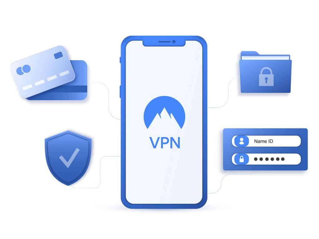
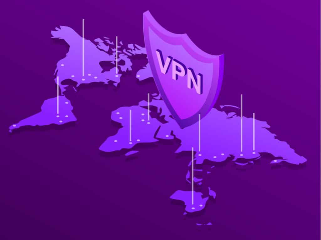
Is a VPN Worth It?
So is a VPN worth it? The short answer is a definitive yes. For the long answer, read on. We’ll cover everything you want to know about VPNs, like what they’re used for, their legal status, the level of protection they provide, how much they cost, the amount of data they spend, and so on.
How to Change Your IP Location with a VPN
A lot of users rely on their trusty VPN to give them access to geo-restricted streaming services and websites. You can’t access the Netflix US library? No problem, a VPN can help you do just that. Let’s take a look at why you would change your IP to a different location using a VPN and how to do it.
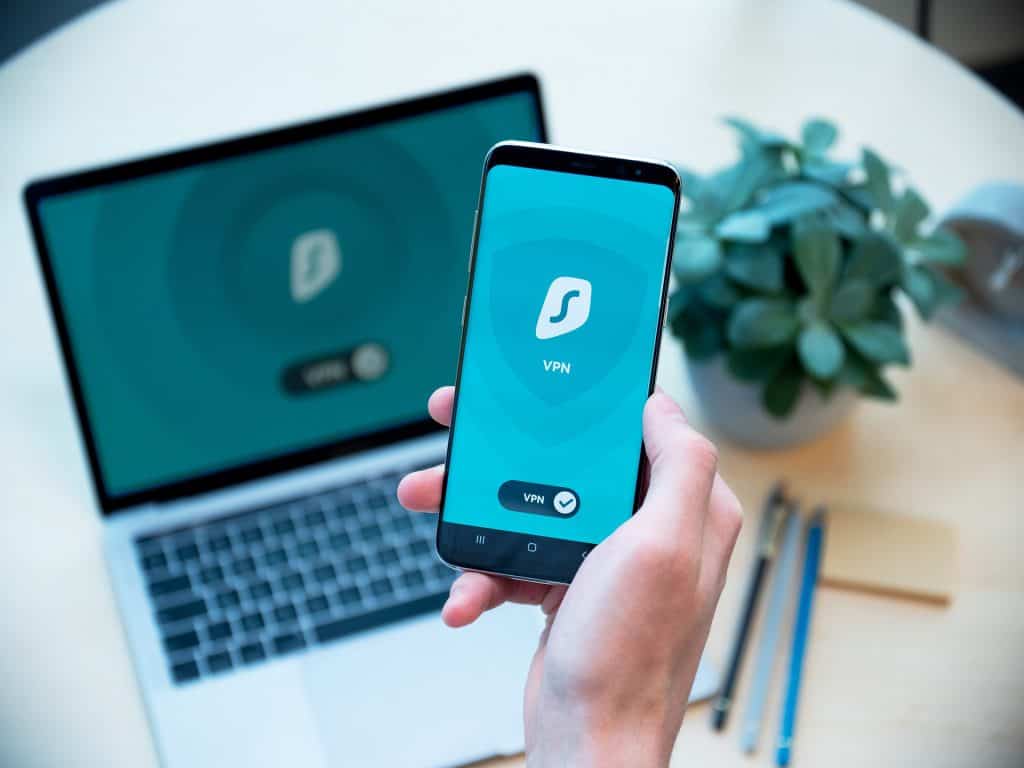
How To Connect and Set Up a VPN on Android
VPN on Android is using a VPN on your Android smartphone to get better privacy, security, and access to geo-restricted content. For instance, having a VPN on your Android phone will allow you to stream geo-blocked services like Hulu on the go.
 Photo by